The Science and Art of post-processing satellite imagery.
By Carl G. Reinemann, USRadioguy.com
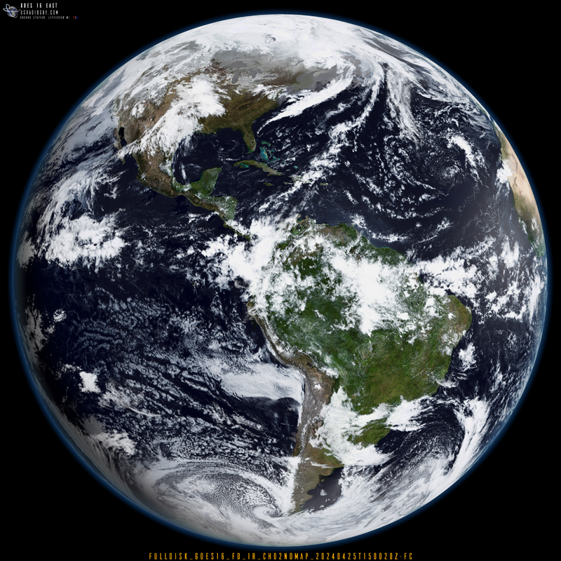
At the most recent NOAA user group meeting, after I had finished my presentation, I had a couple of questions regarding my last slide, which was a full disk image of planet Earth, derived from the GOES-16 satellite and then, using bands 02 and 13, further processed and enhanced by myself. The question was, “How much of this is science, and how much of this is art?
I guess to answer this question, I will fall back on the adage, “Beauty is in the eye of the Beholder”. Science and art, though reaching distinct destinations, share surprising common ground in their journeys. Science strives to demystify the world, building knowledge and solutions. In contrast, artists ‘paint’ with emotions, aiming to evoke beauty or a stir within the viewer, expressed through any artistic medium.
In the image below there is a significant scientific aspect and an artistic aspect.
The Base Imagery:
Used to create the image, are two images from the GOES 16 Satellite, received by myself using my HRIT receiver. The first infrared band that I used, band 02, (Wavelength: 0.64µm (0.60 – 0.68 µm[1])) is located near the red portion of the visible spectrum. This band is also the highest resolution band coming from GOES-R series satellites in the HRIT feed. The resolution is 6561 feet (2 km). There is no “green” channel on any GOES satellites. That is important as all three colors, red, green, and blue, (RGB) are needed to produce a true color image. (So, every single GEO satellite image you see in “color” is, in reality, a false representation of what the Earth’s colors would look like from space.)
The second band I use (available in HRIT) is band 13, (Wavelength: 10.3µm (10.2 – 10.5 µm)). This channel is considered “clean” because it is less sensitive than other infrared window channels to water vapor.[2]
I composite these two bands together using ImageMagick[3] software to merge the imagery into one image, then enhance just the cloud detail. This has the added benefit of also preserving the land mass detail apparent in the band 02 imagery. (this will become important later on in the processing.) So far everything is still very science-based.
How is color created from greyscale imagery?
Since the satellite has no sensors that can detect any green color, which is needed to create RGB, or a color image, we need to figure out how to do that. Some software like goestools and satdump for instance, use a predefined CLUT (a Color LookUp Table) to apply a set of colors to the albedo[4], based on an average range of temperatures- A 256×256 pixel two-dimensional LUT is used to apply color based on visible and infrared radiance with ABI channels 2 and 13. Visible reflectance is represented on the Y axis as color brightness between black and white, while infrared radiance is represented on the X axis as a range of color temperature. It is in this way that color can be painted onto visible imagery as informed by infrared-sensed temperature and visible channel reflectance.
This does have many limitations, and this can be readily seen during different times of the year, for instance, in the winter months over North America, the cold regions have a distinct bluish cast, and during the summer months, they appear to be more accurate, showing the greens, browns and tan colors of earth. (Again, it is just coloring the image based on an averaged CLUT). This is the same way, though in a more complicated process, that NOAA and most processors of satellite imagery use to create Truecolor, or GeoColor using three bands, 01,02, and 13. GeoColor is a multispectral product composed of True Color (using a simulated green component) during daytime, and an Infrared product that uses bands 7 and 13 at night. So, even though the colors are “False Color[5]” it still uses science as the basis for color representation.
The Process
The technique which I adapted to my needs, is used by many weather satellite agencies[6], such as NOAA, CIRA, SSEC, EUMETSAT, and even your local TV weather station, is to use a premade, predefined underlay, or image, of earth. These images are typically compiled by using imagery from LEO (Low Earth Orbit) Satellites[7]. These representations are created and published in a NASA Collection called The Blue Marble[8]. The Blue Marble: Next Generation offers a year’s worth of monthly composites at a spatial resolution of 500 meters. These monthly images reveal seasonal changes to the land surface: the green-up and dying-back of vegetation in temperate regions such as North America and Europe, dry and wet seasons in the tropics, and advancing and retreating Northern Hemisphere snow cover. By using an underlay such as this and using the correct month to match the correct imagery, a very realistic rendering of the earth can be created.
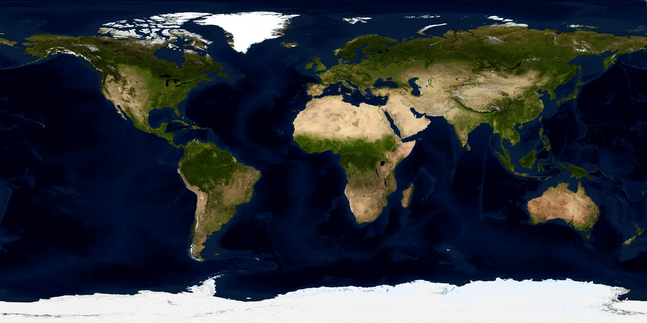
To this rendering of the earth, I further refine the static underlay, using several pieces of software, in this case an older piece of software – Xplanet[9] to generate topographical information, via a global ‘bump map’ (valleys, mountains, and other elevation data) to create a more realistic representation of the planet. This is pieced together from the USGS DEM database. It contains landmass elevations only, with the ocean at zero, and the top of Mt. Everest at 255. This is used as a bump map to give the appearance of the Earth’s rugged surface features. I also used this data in POV Ray tracing as a displacement map on a very finely divided sphere to produce a “true” 3D version of the Earth showing shadows at the correct point during that day. For instance, in a late afternoon view of North America, shadows are just apparent to the east of the Rocky Mountains, while in the early morning views, the shadows appear to the west of the Rockies.
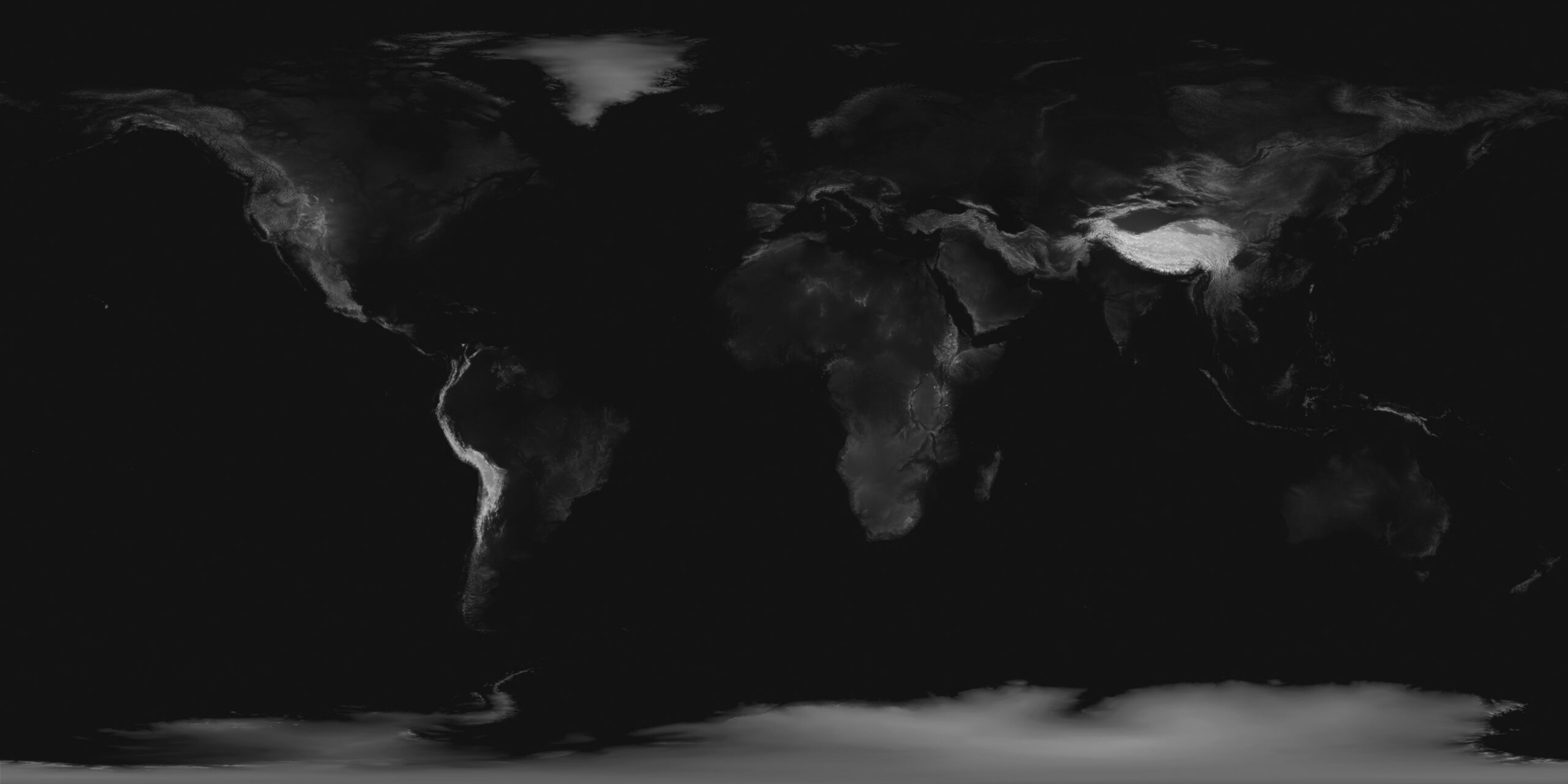
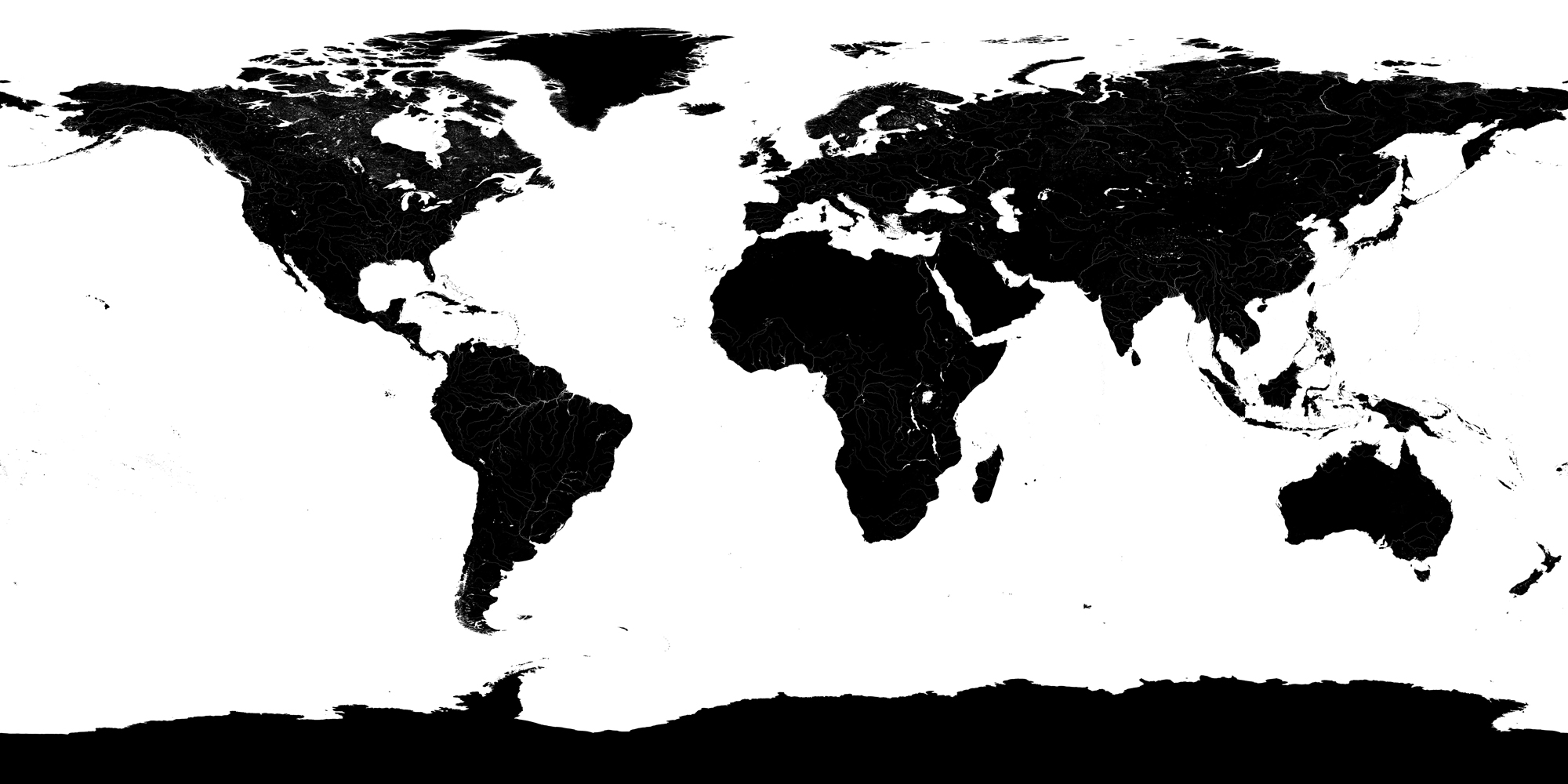
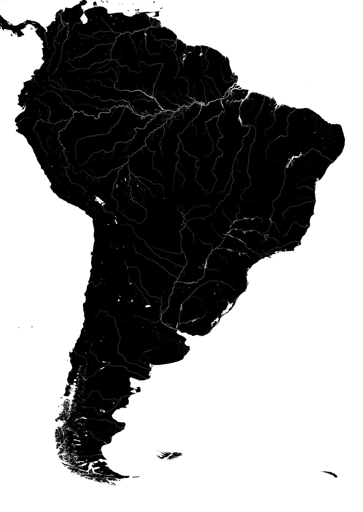
The second step is to use a specular lighting algorithm[10] and a specular map The Earth is a complex planet to render. There are large land areas and there are vast areas of open water that are both specular and reflective including small areas of reflective water such as lakes and rivers. I use a specular map that is derived from USGS DEM data[11], with the addition of the Arctic ice areas which do not show up on USGS data (since they are not solid land masses.) This is then used to add specular reflectance of the ocean surface, and glints of sunlight from lakes, rivers, and streams, all accurately based on the position of the sun in relation to the orbital position of the satellite.
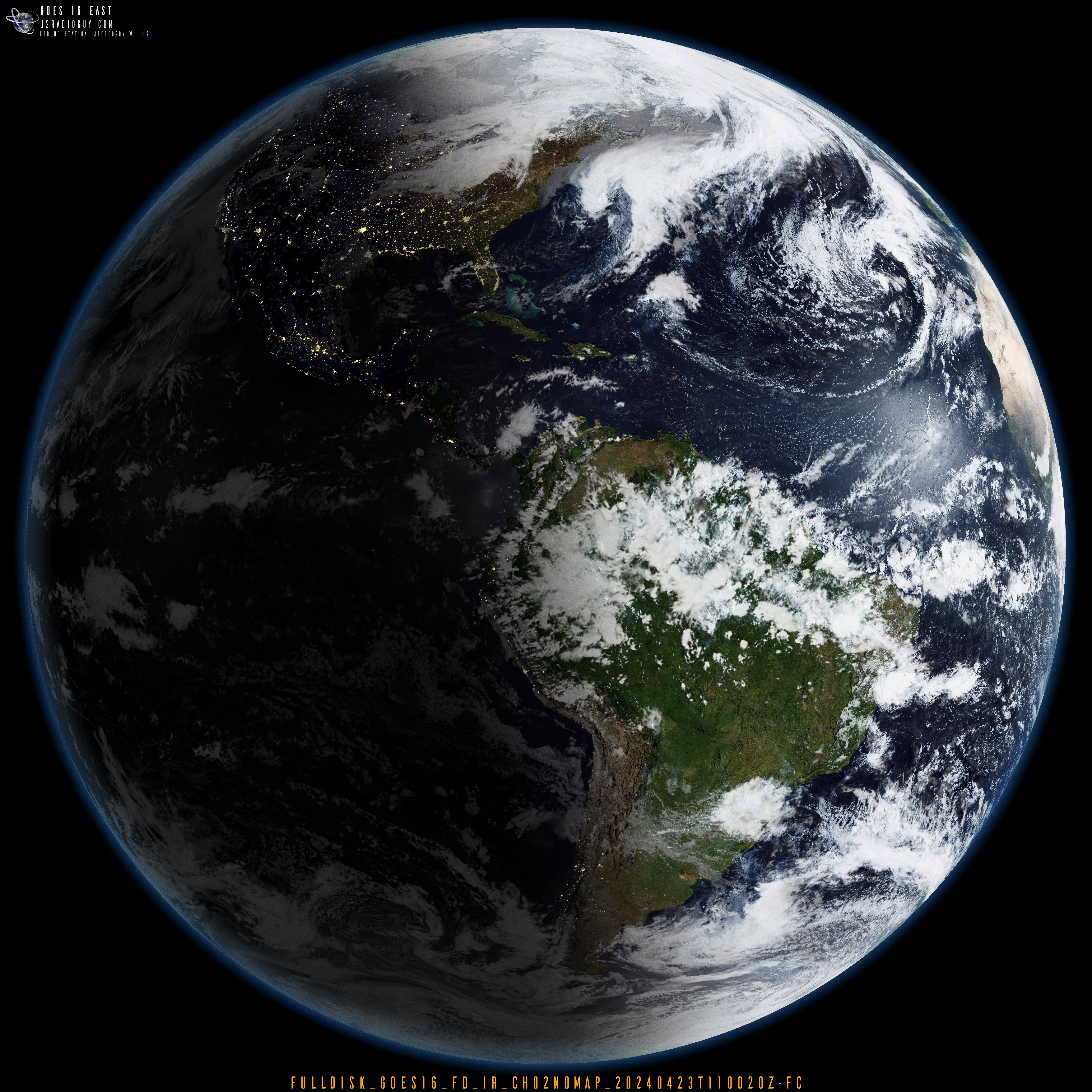
My third step, if I choose to enable it on an image, is to apply a ‘night side’ view of the earth. Since current geo sats do not have the wavelengths necessary to capture the human-made lights of earth at night, again I use a map generated by LEO Satellites, the “Earth at Night” imagery data sets from the NASA Blue Marble collection previously mentioned.
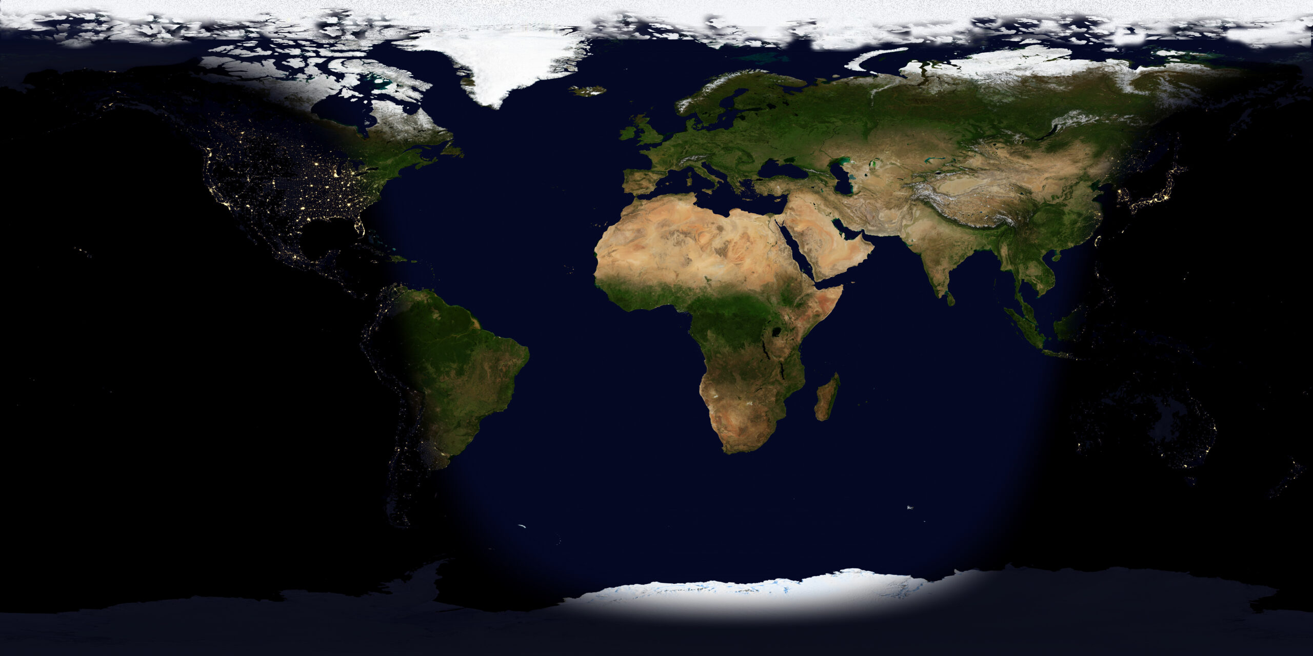
Now, the software I use uses an algorithm based upon the longitude of the satellite (derived from TLE data), the date and time in UTC-hours; minutes; and seconds, and then processes the static image underlay, combining the bump map with elevation data giving the ‘earth’ a realistic topography, the specular map to apply specular lighting showing glints of light from rivers, lakes and the ocean, and then if enabled, create a day/ night view of the planet.
The finished rendered and enhanced planet image has now been created. I now need to apply the ABI imagery from the satellite to the equirectangular static image of the Earth. In the fourth step, using band 13, I create a type of bump map for the cloud layer, using it to create slight elevation changes of the cloud layer based on changes in the grey scale pixel brightness. The combined band 02 and 13 imagery is reprojected into an equirectangular static image using an open-source software named Sanchez[12]. This is then processed to enhance the cloud details for the next step.
Using Sanchez again, the static underlay of ‘Earth’ and the reprojected Band 02/13 imagery, are composited together, creating a flat equirectangular image of the earth with the cloud layer added. With the addition of band 02, the land masses are overlaid with the actual satellite’s 2 km resolution imagery of the earth, enhancing the detail accurately from orbit.
The final step in the processing again relies on Sanchez to reproject the static imagery from the viewpoint of exactly 75.2° longitude from geostationary orbit into a globe representation and add atmospheric hazing, some tinting, and some histogram equalization to the rendered image.
The Final Result
Many other options can be added, such as, changing the view of the planet by altering the longitude, adding LEO Satellite Orbit Tracks using current TLE data, adding stars to the background using data from the Yale Star Catalog, or even adding the sun in the correct place in space.
This method can also be applied to GOES Rebroadcast Imagery (GRB). In the image below click on the small image to load the full-size imagery, and zoom in to see the extraordinary cloud details.
Final Conclusion
So, in conclusion, is it more art than science? I don’t think so. Science is used to make every layer and attribute to the image from scientifically derived data sets. The combination of these is left to me (the artist?).
Despite their contrasting approaches, both science and art rely heavily on keen observation as a springboard for creativity. Scientists meticulously observe natural phenomena, meticulously recording details to identify patterns and relationships. Artists, too, are keen observers of the world around them, drawing inspiration from the natural world, human behavior, and the complexities of the human condition. These observations fuel their creative processes, shaping artistic expression and interpretation.
While the final image might evoke a sense of beauty, the entire process adheres to scientific principles. The selection of bands, data analysis, and manipulation techniques are all rooted in scientific knowledge and mathmatics. The artistic aspect lies in the choices made during processing, such as color enhancement and the use of underlays, which influence the final aesthetic. Ultimately, postprocessing satellite imagery exemplifies the fascinating convergence of science and art, where scientific data is transformed into a visually compelling representation of our planet.
Next steps:
Adding in 3D processing: Using a very similar technique, though drastically reduced in complexity, I have shared on my website https://usradioguy.com/3Ddata/neartime/ and here https://usradioguy.com/3Ddata/index.html are examples using my latest daily global satellite composites to render the earth in space, within our solar system, the sun, the moon, and some satellites in orbit.
Author Biography:
The author, Carl Reinemann, stepped into the reception of Satellite Imagery while looking for a new hobby after becoming interested in and learning how to repair vintage radios. Taking the next step he began experimenting with SDR.
The usradioguy.com website is funded entirely by the author, who possesses a passion for learning new and old things.
The author had a career in law enforcement, having served for 25 years. His career path began as a Law Enforcement Park Ranger, then progressed to Chief Ranger, and finally culminated in the role of Chief of Police. He is a Life Member of both the IACP and Ohio Association of Chiefs of Police. He is now in the role of administration, as Director of a Non-Profit Organization.
The author resides in a small midwestern town with his wife Pamela, two dogs, and a collection of fascinating items. He acknowledged receiving many detailed questions relating to satellite imagery reception and processing and that while not an all-knowing expert, he is happy to share his knowledge and experience gained over the years through his hobby. Additionally, he can connect readers with trusted contacts for further advice or resources.
[1] μm -a metric unit of length, equal to one millionth of a meter.
[2] This helps to improve corrections to atmospheric moisture and is useful for the estimation of cloud particle sizes. Channel 13 will be used in many composite and band differences views.
[3] https://imagemagick.org/index.php ImageMagick is widely used in industries such as web development, graphic design, and video editing, as well as in scientific research, medical imaging, and astronomy.
[4] Albedo is the ratio of radiation reflected by a surface to the radiation incident on it. It’s also the proportion of solar radiation that’s reflected at the Earth’s surface.
[5] So, when you see FC or False color generated by software such as Satdump or Goestools, remember that it is not a ‘real’ color representation, just an application of a color table to a grey-scale infrared image.
[6] NOAA, CIRA, SSEC, EUMETSAT
[7] Suomi NPP, JPSS, and other LEO satellites
[8] https://visibleearth.nasa.gov/collection/1484/blue-marble
[9] Xplanet https://xplanet.sourceforge.net/ All of the major planets and most satellites can be drawn, a number of different map projections are also supported, including azimuthal, Lambert, Mercator, Mollweide, orthographic, and equirectangular.
[10] Specular lighting identifies the bright specular highlights that occur when light hits an object surface such as lakes rivers and oceans and reflects light back toward the viewpoint of the imager.
[11] USGS standard one-meter DEMs are produced exclusively from high resolution light detection and ranging (lidar) source data of one-meter or higher resolution.
[12] https://github.com/nullpainter/sanchez Sanchez is a command-line application. It was designed for processing of greyscale IR images from geostationary satellites, however can also be used to reproject full color images and can be adapted for many uses.