![]()
Spectral Imagery and False Colorization of Geostationary Satellite Data
Updated June 9th 2024
Geostationary satellites like GOES, Himawari, Meteosat, FENGYUN, and Elektro primarily acquire imagery in various infrared (IR) bands along the electromagnetic spectrum. While some possess limited visible band capabilities (typically blue and red), these are often desaturated and not used for generating true-color images.
The absence of a green channel impedes the creation of natural-looking color composites. However, most processing software utilizes at least three bands (two visible and one IR) to generate a “false-color” image through a process known as color mapping. This involves assigning pseudo-colors to specific IR wavelengths based on their correspondence to observed features.
HRIT (High Rate Information Transmission) data users have a single visible band (typically band 02) available. Combining this with an IR band (e.g., band 13) and applying a Look-Up Table (LUT) allows for the creation of a reasonable false-color image.
However, this approach presents challenges. LUTs rely on reflected ground temperatures to assign colors, which can lead to a systematic bias. For instance, higher latitudes tend to appear excessively blue during winter months due to colder ground temperatures. While increasing color saturation can improve the appearance of these regions in winter, it can also lead to the oversaturation of cloud features.
One strategy to mitigate these limitations involves the development of custom LUTs, as you have done for GOES satellites, which aim to balance the color representation across seasons.
An alternative approach, employed by agencies like EUMETSAT, NOAA, and NWS, involves incorporating an underlay image as a background. This underlay typically originates from high-resolution, true-color imagery acquired by polar-orbiting satellites. This composite approach leverages the strengths of both geostationary and polar-orbiting platforms to provide a more informative and visually appealing representation of the Earth.
Using Sanchez as just one part of a series of processes allows me to create some really stellar views of earth, coming close to that Tru-Color imagery from only HRIT greyscale images. In the animation below, you can see the results of this multi layered process which is listed next.
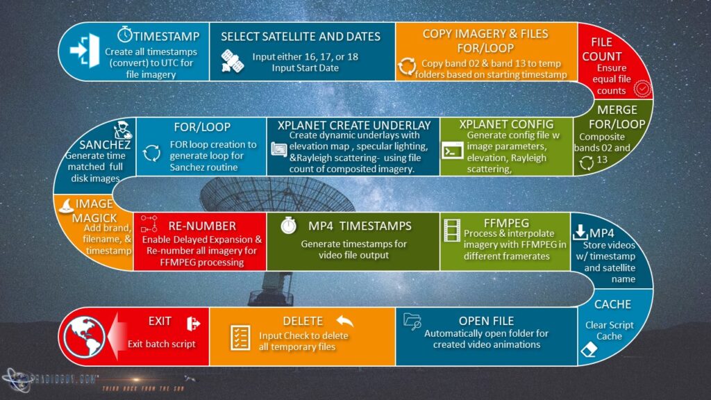
This animation uses many different subroutines, utilizing software such as ImageMagick, FFMPEG, Sanchez, and Xplanet. I use an Xplanet subroutine to generate a dynamic background that is time synched by date and time UTC, and timed to create a matched day/night underlay. The underlay is comprised of two global images of earth, one, the daylight view is from the NASA Visible Earth Project using the most clear and detailed imagery I can find. The nighttime imagery is from the Suomi NPP polar orbiter, showing the earth at night. This is then combined with two bands of imagery, both visible band 02, and IR band 13. I use both bands because if I used just the visible, the night side would have no cloud layers as it would be black.
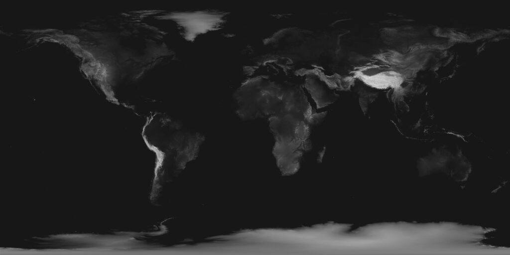
ELEVATION DATA – The underlay also utilizes a few more features. I use elevation data of the landmasses of Earth to build a “bump map” which gives a little more 3D detail to the planet, and allows accurate shadows to fall across mountain ranges and valleys (which can be seen in the animation, especially along the Andes mountain range).
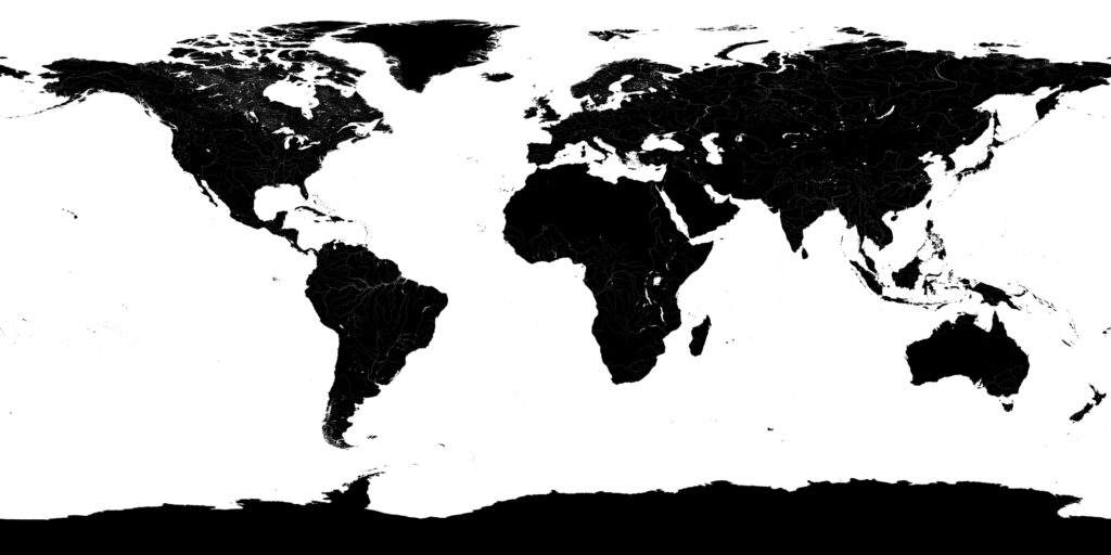
SPECULAR LIGHTING – Specular Lighting is also used to reproduce sunglint, also called a specular reflection, this creates a glint of sunlight reflection on all water surfaces, lakes, rivers, and oceans utilizing yet another ‘map’ known as a specular map. This mirror-like reflection, known as the specular point, is processed by time and date with known keplerian planetary and solar data to show the reflection of the sunlight as closely as possible as the earth moves in orbit, in relation to the position of the sun.
RAYLEIGH SCATTERING
The last process done to the imagery is to apply a subtle rayleigh light scattering effect. Rayleigh scattering refers to the scattering of light off of the molecules of the air, and can be extended to scattering from particles up to about a tenth of the wavelength of the light. It is Rayleigh scattering off the molecules of the air which gives us the blue sky we see. The software needs to create this effect by first creating ‘scattering’ tables
Tables are calculated for fixed phase angles (satellite latitude and longitude – ground point – sun angle). For lines of sight intersecting the disk, the tables are a 2D array of scattering intensities tabulated as a function of incidence (the zenith angle of the sun seen from the vantage of the satellite) and emission (the zenith angle of the observer seen from the vantage of the satellite) angles.
Tables are created at each degree between 0 and 180 degrees for the limb and between 0 and 90 degrees for the disk using the incidence, emission, and tangent height values specified:
For my projections, I use these values:
| Planetary radius of | 6378.140 km |
| Atmospheric scale height | 8000 meters* |
| Index of refraction of air | 1.000293 |
| The density of air at the reference level, in molecules/cubic meter | 2.6867774e25** |
**(changing this can result in the atmosphere looking like watery milk!)
Below is the process chart that outlines the steps in the creation of these types of images and animations:
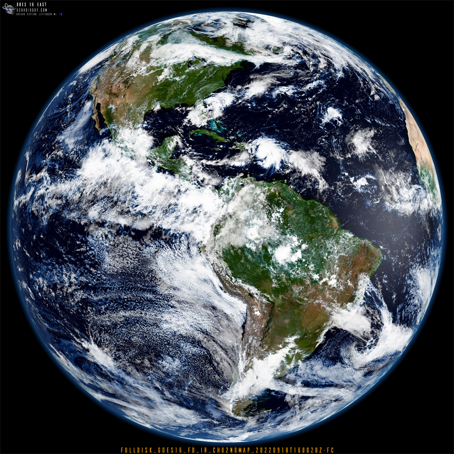
Below is a reduced static image created with the above process, clicking on it will open it up in a new window that you can zoom better.
